PartyUp
Fighting back toxicity in online gaming

Background
It’s a platform that connects people to have a pleasant gaming experience.
Toxicity has always been a big part of the online gaming experience, anyone that has ever played multiplayer games has experienced toxicity at least once. Thinking about the problem of toxicity and its impacts on the gaming world, PartyUp was create for gamers to engage and play together.
Problem
Playing competitive and multiplayer games alone can be a very stressful experience
Many people avoid playing certain games fearing toxic behavior in online matches. Online gaming is a very social experience, where people want to feel part of a community of like minded individuals, where they have others to play with and to exchange game knowledge.
As a gamer myself, i have encountered the same problem multiple times, where i was afraid of playing and encountering toxic behavior, so i set my goals in trying to mitigate the problem of toxicity in games and creating a safe space for gamers.
Solution
Making the search for a match conscious

User Interviews
I conducted a form for gamers to better understand the gamers perspective about toxicity and their sense of community.
Frustrations
- Fear of talking in voice-chat and receiving hate
- Only being able to play with friends or in a closed party
- Afraid of getting called out after a bad performance
- Having to stop playing because of toxicity
Goals
- Join a community of other people with similar interests
- Share thoughts and plays with someone
- Learn new things about the games played
- Expand social groups
- Have fun while playing
- Getting up to date about gaming news
Opportunities
- Connect people through user created communities
- Build trust between users
- Create an environment for users to talk about their favorite games
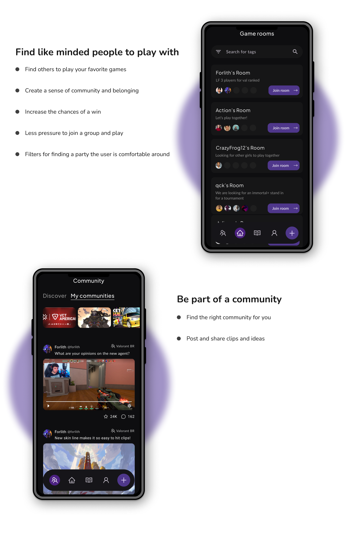
- Less pressure to join a group and play
- Filters for users to find a party they are comfortable around
Who would like to choose PartyUp? What we know about them?

How to make PartyUp easy to navigate
It only takes the user a max of 4 screens to get to the main task (playing) on PartyUp

This is how PartyUp came to be:
An overlook over my process when creating the mobile version of the app


A major improvement in my design
Based on previous ideas of the bottom navigation bar, I continually iterated my design over until inspired by the material UI solution, created a more slick and fixed but detached from the screen version, allowing the main action in the screen to be easily recognisable and all on the same spot.

The final product

Conclusion + Lessons learned
What i'd do differently next time
This was my first-ever UX project. More than the actual product delivered, I’m immensely grateful to have been through an entire UX process so I can finally put in practice all that i have learned. On that note, this is what I've learned:
- Iterate as much as possible. Although I iterated quite a bit of my design, especially on the mobile development, I wish i could have iterated more and have taken a bit more time to scoop out some other ideas that were more out of line from what i had in mind.
- Develop web first. For this project, I went with a mobile-first approach, but later when designing the web version of the app, I realized that there were a lot of functionalities and components that would make nice additions to the already existing mobile design. I would like to personally test the web-first approach in my next project, taking advantage of the bigger space to allow more creative freedom, and then applying the mobile constraints to it.
- Do more research. Although I felt satisfied with my research on te topic of my product, i would like to try doing 1-1 interviews and usability testings to further understand user needs.
For more work inquiries do email me at [email protected]
Thank you for reading!